Over the past two years I’ve used R within RStudio environment as my only data analysis/visualisation application for my research. For the most part I’m a self-taught R/RStudio user, and I’m quite pleased with how far I’ve come in terms of being able to do pretty much everything I need in terms of data analysis and visualisation, and a significant part of writing up using RMarkdown in RStudio. In terms of data visualisation in R, I guess ggplot2 is what everybody turns to first, and I’m no exception. I love ggplot and the flexibility it allows in terms of creating figures. However, there are some other packages which let you create some interesting plots either for exploratory analysis or from the regression outputs. I briefly discuss two such packages that have become my favourites over the last couple of years.
beeswarm
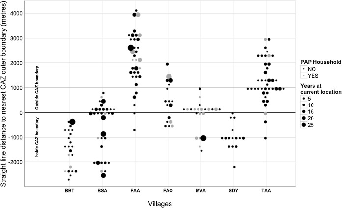
I’ve become a huge fan of beeswarm plots ever since I discovered this package while looking for ways to plot individual overlapping points on a two dimensional plot. Not only this package allows us to plot individual data points that would otherwise overlap, it also allows to save the beeswarm plot data as datatable, which can then be plotted using ggplot with additional dimensions as necessary. This is exactly what I did for the figure below that formed part of this journal paper published in 2016. In addition to the location of data points in beeswarm hex arrangement, we changed the colour as well as size of the data points based on additional information in two other variables. The resulting plot is a simple representation of the location of respondents’ dwellings from the park boundary, but also providing much richer information without making it too complicated or confusing to look at.
sjPlot
I first came across sjPlot package while trying to find a way to create nicely formatted tables for regression outputs in R. However, over time I’ve used this package more to visualise results from different types of statistical analyses in R that I carry out for my socio-economic research, which I guess is not surprising given the package description, which I quote below:
“Results of various statistical analyses (that are commonly used in social sciences) can be visualized using this package, including simple and cross tabulated frequencies, histograms, box plots, (generalized) linear models, mixed effects models, PCA and correlation matrices, cluster analyses, scatter plots, Likert scales, effects plots of interaction terms in regression models, constructing index or score variables and much more.”
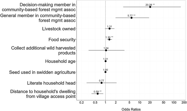
Among several other types of plots, I used this package to create the odds-ratio plot shown below, which featured in our journal paper published in 2016.
I often use sjmisc package together with sjPlot, especially to create nice variable labels to use in the plots or tables. Another reason why sjPlot is among my favourite packages is its active development and a very useful set of blog posts with examples, and prompt response to comments on these posts whenever I’ve had any queries regarding the package.